Crave’s Rebranding
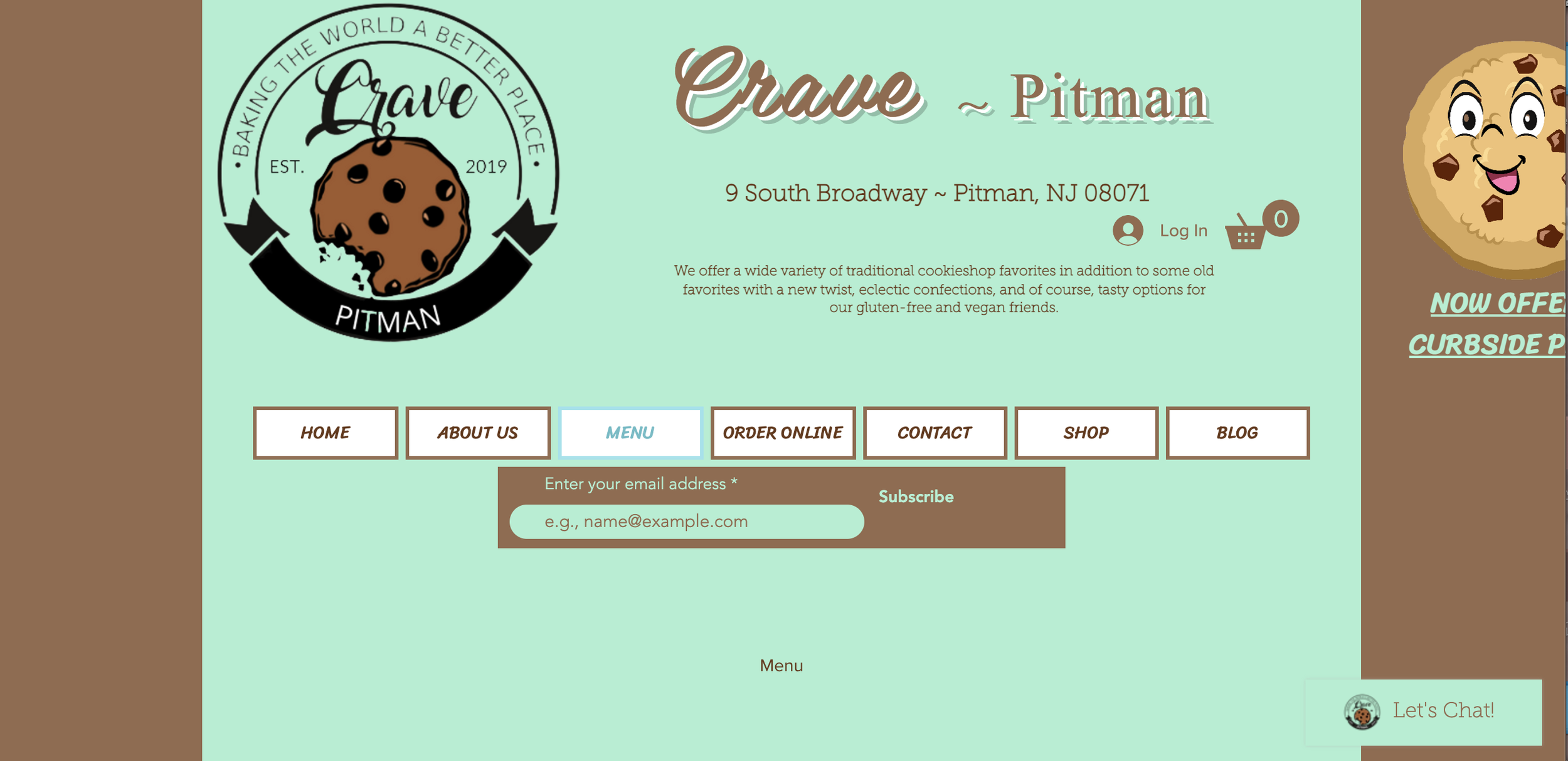
Crave is a delicious local family-owned bakery in the heart of Pitman. With their main focus being their selection of tasty cookies, they also offer brownie bars, cookie cakes, teas, and coffees. Crave provides a complete experience for customers, as they can watch the cookies being made and baked, filling the air with the sweet aroma of fresh-baked cookies. Customers can come in and sit while enjoying their snack or take it to go. While Crave’s cookies are creative and appetizing, their current branding lacks this same luster, leaving room for improvement.
Their current branding is mint and brown, and their logo is busy. I wanted to design them branding that is more reflective of who they are and is as enticing as their cookies. To start this rebranding journey, I began by researching in-depth Crave and its values, along with its audience and competitors.
Crave’s audience consists of mainly 15-25-year-olds, these people being those who live in Pitman and neighboring towns, families with young children, as well as teens and young adults. The bakery experiences a high volume of local families as their customers, with kids being the main reason for purchasing their products. As for their competitors, there is another local cookie bakery called Just Cookies. This bakery caters to a different audience, this being mostly people hosting parties and events. Just Cookies creates custom cookies for larger orders, as well as some sample cookies for those wandering in the storefront. Another local cookie competitor is Cookie Munchers, a late-night cookie delivery store in the neighboring town of Glassboro. This store mostly caters to the local college and teen audience, as their hours are late, staying open to 1:30 am on weeknights and 3:30 am on weekends. Cookie Munchers also only offers delivery or pickup, without a dine-in option. Each of these bakeries are competitors but are very unique from each other in what they offer and who they are targeting as their audience.
Based on all my research, I began to dive into Crave’s rebranding. I started by designing a few different logo options using Adobe Illustrator. From here, I decided on which logo I thought best represented the brand and its messaging. I went in-depth, defining fonts and colors, as well as a sub-mark and alternative logo. For the fonts, I decided on Blue Monday for main titles and for the logo, and I paired that with Rounded Mpluc 1c for body copy. I thought they paired well together because of their similarities in the rounded ends and tall lettering. As for the colors, I wanted them to be inviting and more reflective of their product, replacing the mint green, with a more fitting pallet for cookies, consisting of tans and browns. On the brand board, I created, I also included images that also helped sparked the inspiration for their logo and brand colors. These images also include Crave’s own cookies!
After defining all of these branding traits in the brand board, I created an overarching brand plan that contained my research into the brand and its competitors, along with the branding I created.


