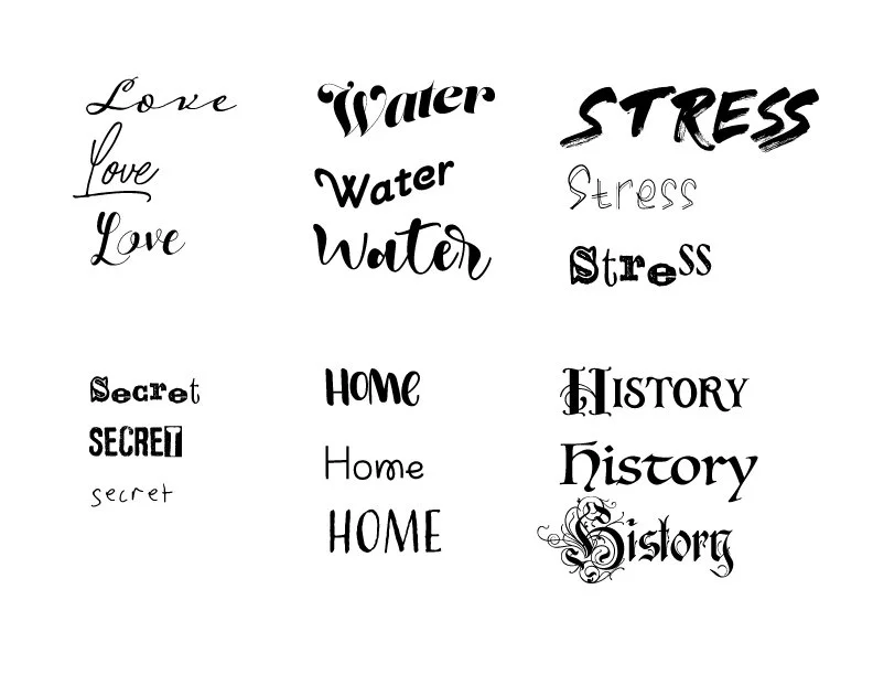
Exploring Type
Typography is an important fundamental part of any design. Having the right font for your design can either bring out the traits you are trying to portray or the wrong font can bring across an entirely different meaning. Good typography, chooses the correct fonts and pairings, as well as proper placement and use of hierarchy, drawing the eye into important pieces of the design.
This week I began exploring typography by first experimenting with how fonts and different typefaces can bring across meaning and represent the topic they are illustrating. I started by picking six random nouns and exploring what they represented. The nouns I chose are love, water, stress, secret, home, and history. From there, I began my search to find fonts that I thought best brought their meaning to life. After I found some that I thought represented the nouns, I chose three fonts for each to try and show the meaning of the words.
I used fonts I already had, as well as additional ones I downloaded to create this in Adobe Illustrator. I also made some changes to the words as well, such as adding a wave effect to the water type or increasing the size of the stress type, and decreasing the size of the secret type.
After I spent some time exploring and researching typography, I decided to create a type specimen for the classic font, Bodoni. The font was created in 1798 by Giambattista Bodoni and is classified as modern didone. Bodoni is a serif font and is known as an elegant typeface often found in magazines and editorials.
I created this type-specimen in Adobe InDesign. I wanted this poster to not only be a portrayal of the font but also be a functional representation of what it can look like in different sizes, weights, as well as informative. I used differences in size and color to display the hierarchy in the poster and I used the Bodoni not only for the text but also for bigger background pieces in the design. To inform the viewer about the font, I added numbers, the alphabet, a sentence in multiple font sizes, and a paragraph in book, book italic, and bold, so the difference can be seen between them. Because typography is such a huge part of the design, it is important to know about major fonts and typefaces and to be able to distinguish between them. type specimens, such as this one, can help people get a better understanding of the typeface or font they are looking into.
This week, I also spent some time adding to the brand identity of the Crave branding project I worked on last week. I created five brand identity pieces, including a large cookie box, a small cookie bag, a coffee cup, stickers, and a hat. Each of their items can be used in the shop for both branding and functional purposes. The large cookie box can be used to package bigger orders, while the small cookie bag can be used if the customer is only ordering a few cookies. The stickers can be used to seal both the box and the bag to ensure they do not open, keeping the cookies fresh. The coffee cup can be used for any coffee drink orders, and the hat can be used for employees to wear as part of their uniform.
To create these mockups, I used Pacdora for the packaging products, including the box, bag, and cup, and then I also used two downloadable mockup templates for both the hat and the stickers. Once I mocked up each individually, I put them all together in a photoshop file, adding shadows for dimension.


