Visual Research and UI Design
This past week, my partner and I worked on collecting visual design inspiration and turning that inspiration into three different user interface (UI) designs. UI is just as important as UX, and it is important to do visual research and creating different versions, before just jumping into the design.
Visual Research
Visual research is about researching colors, typography, layout, imagery, and all the other aspects that are needed for the UI design. In this stage, it is important to do as much research as you can, to collect a large base to gain inspiration and ideas from. The littlest thing can help spark an idea that makes your whole design. Don’t skip over this step when going into a design. Visual research can help really take your designs to the next level of professionalism and can also help bring a focus to how the user will perceive the design.
Our Visual Research
My partner and I started our week by creating boards to which we saved our visual research to. We used Dribble and Pinterest and searched for colors, fonts, images, and layout designs that would inspire us as we started out our designs. We looked at things we liked and didn’t like about certain layouts, and chose our colors off of fruits that inspired us. Our visual research helped us a lot with making some design decisions and gave us a strong starting point for our three different UI layouts.
What is User Interface (UI) Design?
UI consists of all the visuals that bring the design together. UI creates design patterns that bring it all together and we are able to reference back to throughout the process.
“User interface (UI) design is the process designers use to build interfaces in software or computerized devices, focusing on looks or style. Designers aim to create interfaces which users find easy to use and pleasurable. UI design refers to graphical user interfaces and other forms—e.g., voice-controlled interfaces.”
Our UI Designs
To experiment with our UI ideas and designs we chose four key screens to try out our ideas and see what comes together with the best. We used our visual research to help drive our decisions and in the end, decided what design choices we liked the best and what ones we didn’t.
In this first design, we went simple with the color palette, keeping it clean with white, black, grey, and a pop of peach. We went with this because we felt like the smoothie images had a lot of color within them already and thought the one pop of color would be perfect. We also thought it is interesting to add some illustrations in as well, so we did that for the last two pages.
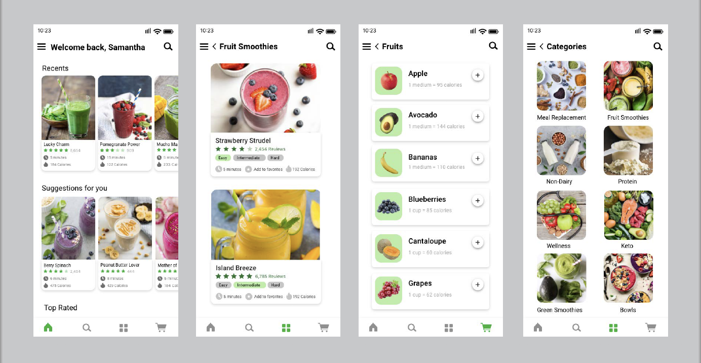
For this second design, we went with our accent color as green in varying shades and played around with different layouts. We also substituted the illustrations for images in the last two pages. We kept the font similar, as a clean, readable font, and tried to keep the focus on the smoothies themselves.
On our last design, we played around more with color, going for a pastel color palette of green, yellow, purple, and pink. We, again, tried a different layout for the first two pages and tried the illustrations again for the last two pages. We kept the colors strong and prominent across all four screens but kept a simple a clean font.
After we finished all our screens, we sat down and talked about what we liked the best from our designs. We loved the peach accent color of the first one, the homepage layout of the second one, along preferring the images over the illustrations. We are glad we experimented this way, as what we have learned here will help further our final design and create a cleaner, and perfected final UI design.
Sources:
https://www.smashingmagazine.com/2018/02/comprehensive-guide-ui-design/
https://uxdesign.cc/7-simple-methods-to-get-better-at-visual-ui-design-21fec0f417b5


