Photography & Design
Adding images into your designs can have a huge impact. As both a photographer and designer, I know the marriage of the two can drastically increase the quality of your design and help paint a clearer picture.
I started out this week by creating three different types of mood boards, each with a different aesthetic for one brand. The brand I chose to create these about is The Bean Coffee Company. They sell an assortment of different types and flavors of coffee beans. I created these boards with a specific idea in mind of different times people drink coffee or the different types of people who would be consumers of their product. Each of the boards is almost entirely image-based with some pops of color as well as the brand logo. These boards are an example of how you can tell a story through images alone.
This first mood board I created was based on the aesthetic of dark academia. As a student myself, I know coffee is a go-to for both students and teachers. On a cold rainy night, nothing helps me focus more on my work than a warm cup of coffee to get me through.
This second mood board is based on the idea of your morning cup of coffee. For many adults, the first thing they do when they wake up is to walk into the kitchen and make themselves a cup of coffee. I wanted this board to reflect the idea of that showing a light and bright morning aesthetic.
This last mood board was created with the theme of travel. When you are on the go and exploring the world, packing maybe one too many activities into your day, coffee is the fuel you need to conquer it all.
Outside
Inside
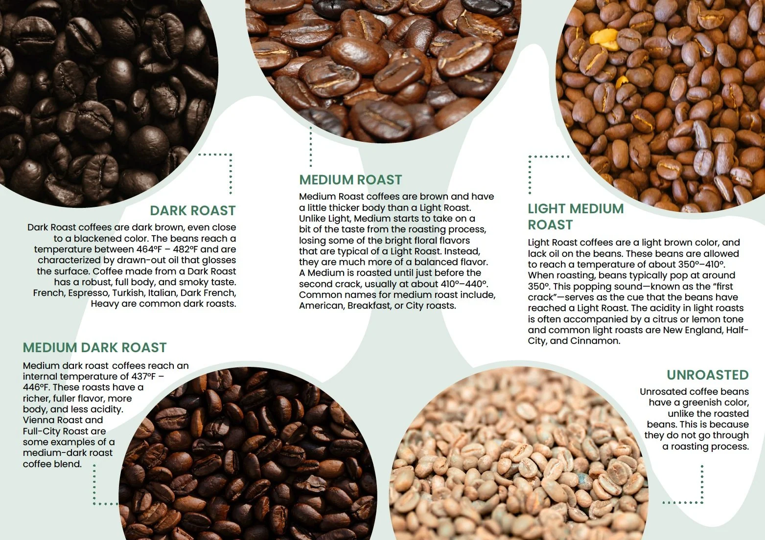
The next project I worked on was creating a trifold brochure design for The Bean. I used some of the images I collected from working on the mood boards to help me create this design. For those who aren’t coffee connoisseurs, you might not know where to start when purchasing a bag of beans. The Bean has a large selection of options to purchases and it can be a bit overwhelming if you don’t know exactly what you are looking for. This brochure focuses on the different types of roasts that beans endure. Each results in a different color and taste, so it is important for a consumer to purchase the one they like the most. This brochure focuses on helping consumers find that perfect roast they are looking for to enhance their shopping experience. I used specific images to help display the differences between the beans, which enhances the understanding for the reader that design alone, could not provide. This is a great example of how design can be enhanced when the right images are used to help tell the story.
Lastly, this past week, I also worked on some label designs for a line of skincare products. I wanted to design high-end, luxury skincare products and focused on a line of night masks. For these mock designs, I came up with the brand name Femme Brilliante, which is french for Bright Woman, since the product will leave you with bright glowing skin. For the three different mask labels I created, I focused the theme on different plants, giving the products the names, tropical hibiscus, midnight lavender, and euphoric eucalyptus. Each has a different drawing of the plant and the color of the label and the container both reflect that as well. I created these label designs in Adobe Illustrator and then imported them into a Photoshop mockup to display them on the product.


